Sunday, 9 October 2011

018 - Tarzan pose

One of our assignments was selecting a character from a Disney feature, learning how to draw that character, then coming up with an original pose for the character.  I chose Tarzan.

I've heard that more realistic characters are harder to draw, but I figured it would be a neat mix of life drawing and design.  Plus it gave me an excuse to look over all the awesome Glen Keane Tarzan drawings.

Check out the first pic and if you have a sec, let me know what is going on in the scene...


Had a look?  It was supposed to be Tarzan reaching for a glove, but I kept hearing that it looked like really weird hanging arm or disembodied hand...Not what I was going for.  So although I liked the idea of the glove,  I didn't want the focus of the pose to be "what is that weird thing he's reaching for?"


So I changed it to an apple.  As for the pose itself, I'm happy with most of it.  I like that there is some twist in the legs, and the feet came out alright.  I think the left leg might be a touch long.  The face is a little off, but Tarzan's face was oddly hard to draw, and the left arm seems a bit awkward.  Like the energy in the pose though, and it does feel like he's reaching for that apple.  Pretty happy with it though.  I also tried doing some life drawings where I turned the model into Tarzan - slightly easier to do with a male model than a female model.

017 - Good resolution of a not so good animation

This is one of my first attempts to animate with TVPaint.  It's like drawing on paper, but there is no paper involved.  It's all done on the computer.  I think I'll like it once I spend some more time with it.

It's a character with "roughly" Stich proportions.  He jumps, bounces, then lands...but in HD!

Wednesday, 5 October 2011

016 - Sheridan Art Fundamentals Stuff: Part I of II

Last year I took the art fundamentals course at Sheridan College.  Overall it was pretty good.  There were some things about it that were great, and some things that were...so so.  I was fairly confident that I wanted to get into an animation program for the next year, so although some of the projects were interesting, they weren't really going to help my portfolio in the short term.

There are a lot of people in the program; I think we had 12 or so classes with about 30 a class last year.  The program seems geared towards improving and experimenting.  A lot of the people applied to either illustration or animation programs but needed to improve their portfolios.  Some people wanted to get into design programs, other people wanted to learn new skills and see what interested them.  So it's geared to a lot of different tastes, which means everything won't be geared specifically to animation, illustration, or whatever.

I'm throwing down a bit of background info here in case you happen to stumble across this online.  Sheridan art fundamentals review perhaps?  Sheridan art fundamentals opinion maybe?  I remember looking around before I started the program, and not having much success figuring out exactly what I was getting into.  If you just want to see some of the stuff I did last year feel free to skip ahead.  It was a pretty good program though.

We had 6 classes per semester, each class was 3 hours.  So the actual class time wasn't overbearing.  There was a decent amount of work though.  On top of the school work though, was working on personal and portfolio work.  Just doing the work probably won't get you into one of the more competitive programs.

The best part of the program was the extra life sessions.  Figure drawing was available four nights a week from 6:00-9:00.  This was included in the tuition.  Figure drawing was a huge part of improving my drawing skills, and probably the most important skill to show for portfolios for animation.  Being able to work on it more than I could was great.  I probably averaged 2 out of 4 sessions per week.

The classes had slightly different names each semester, but the courses were:
1. Life Drawing
2. 2D Design
3. 3D Design
4. Painting/ Colour Theory
5. Drawing Systems/ Perspective and Rendering
6. English class/ Elective


Those might not be exactly the names, but that's how I remember them, and basically what the courses were about.

I'll get 6. out of the way right off the bat - first semester was technical writing, reports, bibliographies etc...meh...Second semester was a choice of an elective from a limited number offered that worked with your schedule.  I got the one I wanted, which was fairy tales.  We read and discussed some classic fairy tales.  It was fun, but when there was the pressure of portfolios looming it sometimes seemed to get in the way.  I learned things from it that will be useful, just not in an "evident right away" sort of way.

2.  2D Design
Lots of painting with gouache, line, shape, texture.  Geared to graphic design, advertising almost, illustrative style.  This class was alright.  Learning about design was fun.  Gouache is a pain haha.  Simplifying and stylizing ideas can be fun.


Values and colour schemes.  I like this one.

Colour thing.

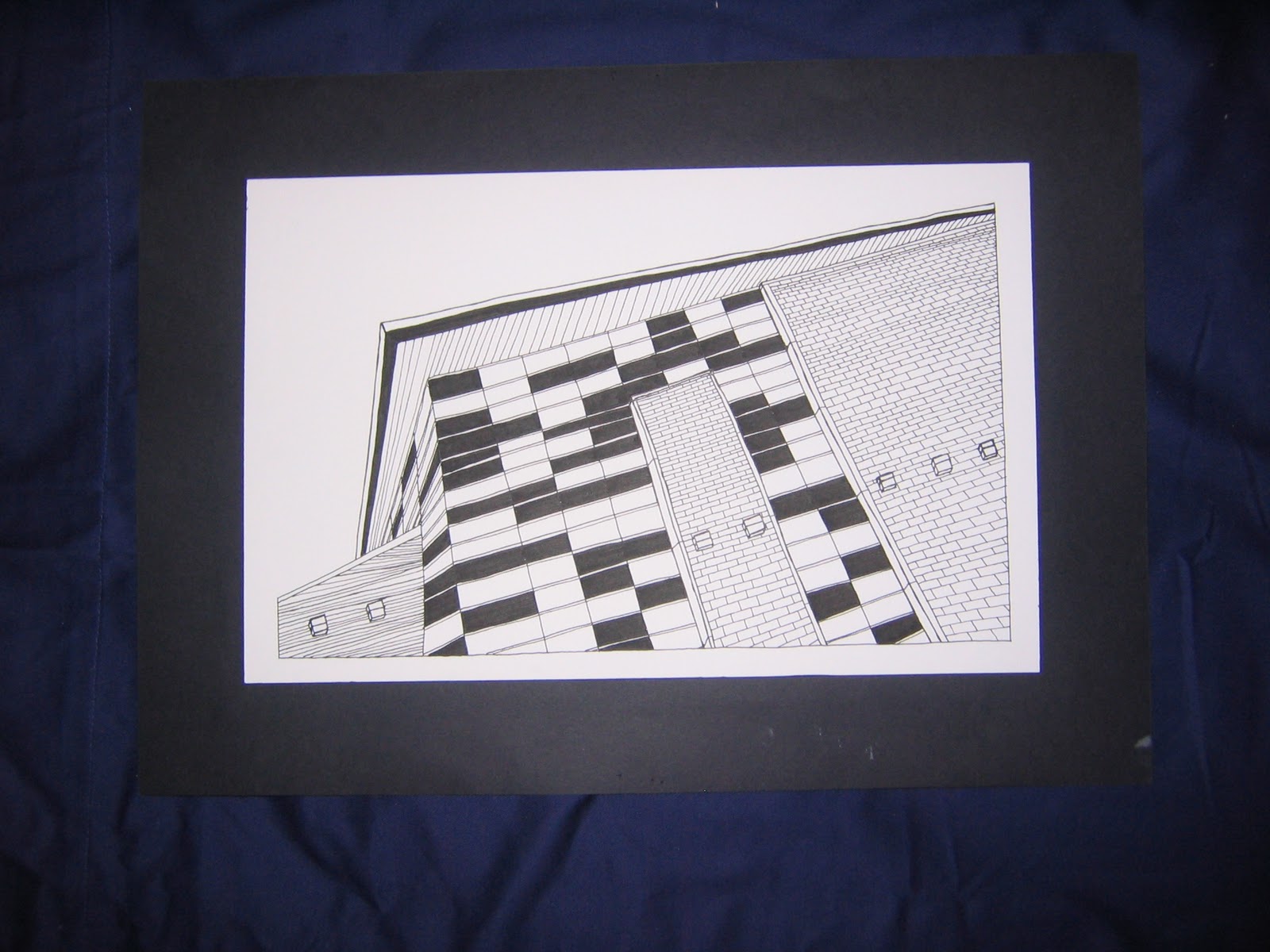
Lines Textures Shapes.  Black and white.

More black and white design.  Those bricks took forever to draw.

Christmas card.  It's a PS3 blueprint.  I like the colours here.

Quick in class thing.


Logo for a group promoting bikes instead of cars.  Like this one too.


Trying to "paint" with gouache here.  Like the shark.

Can you find my initials: PLW?  It's also a piranha.

Our family dog Millie, with a creative colour scheme.  I had to put the letter D in there, so I sort of it hid because it was annoying.

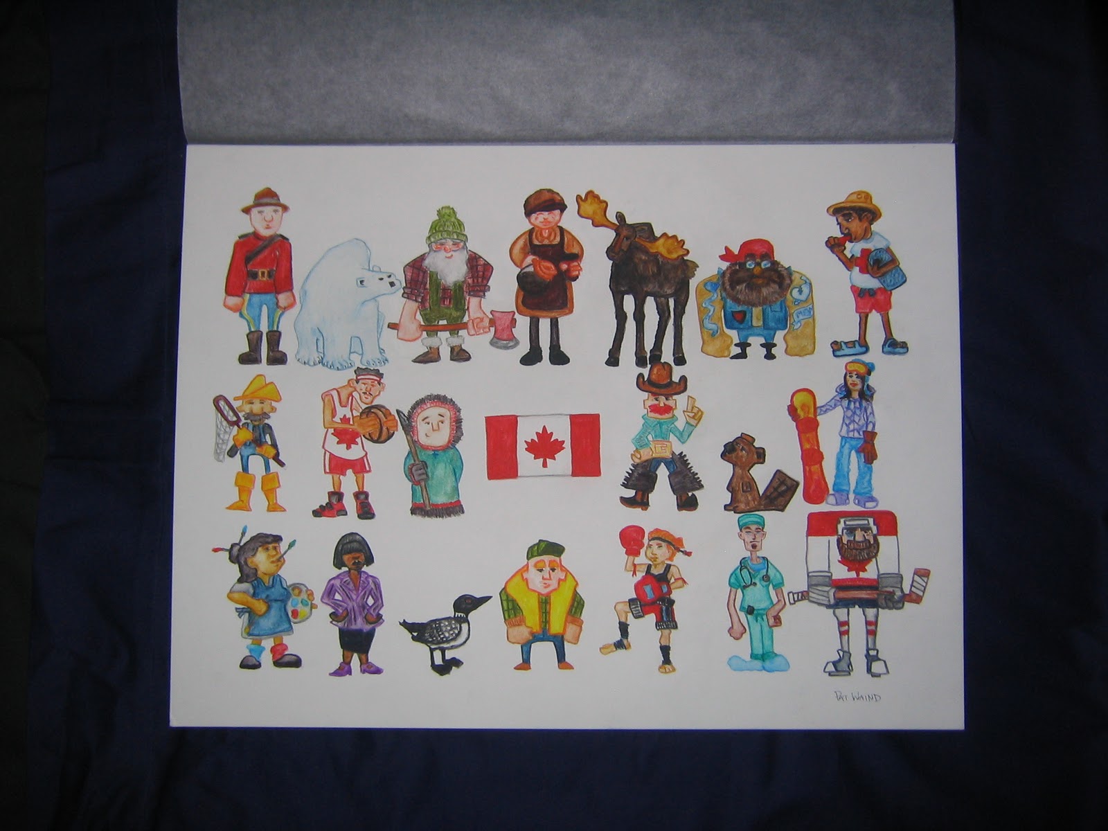
For a project about Canada, I managed to sneak some character design into the course after-all.  Like this one, which is good because it took forever to colour.

Timeline of a day.  Kind of rushed if I recall, so went for a minimalist design.

T-shirt design.


That's most of that class.  Yikes, this could take a while.


3. 3D Design
Sculpture stuff.  I liked second semester a lot more, the projects were more interesting.  Some of the projects that sounded "dumb" actually ended up being my favorite.  Telling a story on a shoe?  A pop-up book?

rough pop-up

I actually really liked this project.  Way more than I thought.  We picked a song, and then did something to a pair of shoes, so that it somehow related.  I picked "On the Way Back Home" by Lucero.  Sweet band, check the tune out and then have a look at the shoes.

"To get outta here, two options one chance, you joined the army, I started a band"

I really thought this was the dumbest project when we got it, but once I started scribbling some ideas out I really started liking it.  I did some rough sketches for some of the things, but drew most of them straight on in marker once I had an idea.  I tried to mirror things so that each shoe tells the story of one of these guys.  One guy joined the army, one guy in a band.  How they meet up and reminisce.  How there is one girl that they both think about.  I tried to draw similar things in the same place on each shoe.  One guy plays guitar, one guy carries a gun, albums, maps, radios, amps, a girl, booze, cards, a ghost.


This is a shark mask that fits on my face but scratches it up like crazy because the paper mache shrunk the frame.  Part of the marks were for wear-ability,  so I tried to pretend that teeth weren't digging into my face - they actually were quite sharp.


This is my head made out of cardboard.  This project took a long time, and used a lot of both glue and cardboard.  It was slightly less freaky as a hat-rack.

a series of shapes in different mediums.


This one surprised me too.  Really liked this one.  Kind of like a 3 panel storyboard.

Panel 2.  Just paper and pencil crayons.  "crazy" colours, mostly because that was what I had left hehe.

This panel is up there for my favorite thing of the entire year.

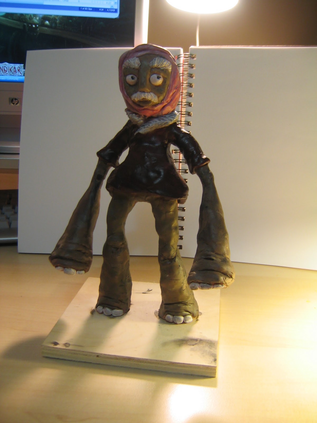
A sculpture of a character I designed.  I made up some story as to how he was cursed with elephant paws. I'm happy with the expression.

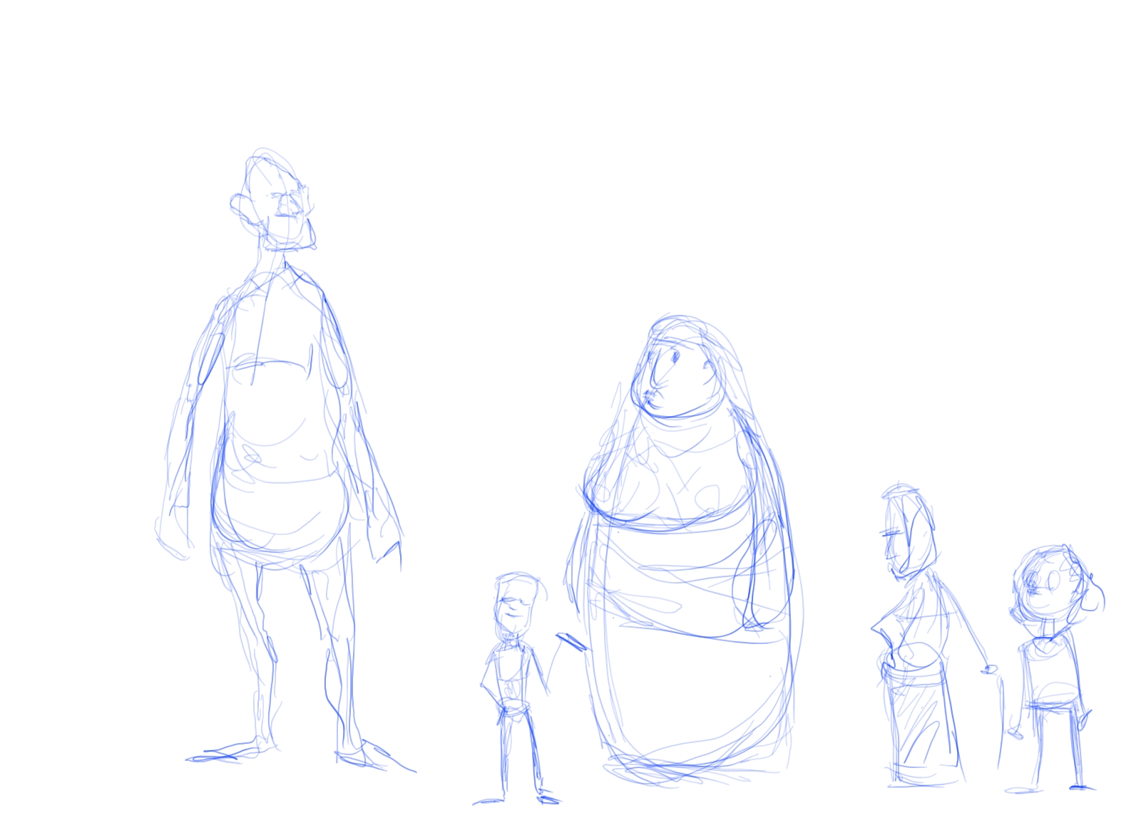
This was the unpainted guy.  Pretty sure I "designed" him as I sculpted.  Next time I will definitely try to draw the character first.  I liked this one too.


Some of my favorite projects from the year were from 2D Design and 3D Design, which surprised me a bit.  Alright, that's 3 of the 6 classes taken care of.

Part II sometime soon...

Sunday, 2 October 2011

015 - Summer Stuff

I took a digital animation course this summer.  I knew that I would be starting the animation program at Capilano in the fall, and was hoping the summer course would give me an idea of whether I wanted to focus on digital animation for the third year of the program.  Here's some of the stuff I did, and a bit about the program.  And in case you're thinking about maybe taking the course, hopefully Google will have helped you out by finding this line...

Capilano University computer animation and visual effects review

or maybe this one...


Capilano University computer animation and visual effects opinion


The course was two months long, from the beginning of July to the end of August.  The days were pretty long, usually from 9:30-4:30 with an hour for lunch, and then often working for an hour or two after class was over.  It felt like about a semester's worth of work done in half the time.  I liked how intense the program was, but if you're trying to plan a lot of other summer stuff as well, it could be a bit rough.

Each week was roughly 2 days of animating, 2 days of modeling, and 1 day of traditional design.  Mixed in with that were some effects demos, other digital stuff, and a bit of sculpting.

The lab set-up was pretty sweet, I had my own computer for the summer, complete with one normal monitor and one Cintiq tablet.

I learned a lot and enjoyed the program.  The teachers knew their stuff.  Here's a link to the school's site if you want any more info.

Now keep in mind, I'm not saying that what I'm about to show you is good animating or modeling haha...but for 2 months with no prior experience in 3D it's (hopefully) not that bad.

This was our first introduction to the Morphy character rig.  I somehow got his feet twisted 180 to the rest of his body and then let the computer magically "fix" things in mid air.


A nice creepy/awkward walk cycle.


A less creepy/awkward run cycle.


Some simple modeling and rough poses inspired by the TV show Wipeout (there are some amazing YouTube clips out there - definitely fun referencing this one).


We also built some simple rigs, and did some physics engine and effects stuff.

Here's some pics of some models I built in Maya.

An octopus speed model.

A cheetah speed model.  Ferocious yes?

I kind of like this one.  Hand painted textures.

Here's the door without texturing.

Hand model without and with smoothing.

I started building this scene (inspired by the PS2 game Jak and Daxter), but decided to focus on animation for my final project instead.

I posted these two vids before, but here they are again.


This was a nice step up from my earlier Morphy stuff.  I got a second character in there, used a constraint on the ball, a deformer on the mesh, and had a few different things animating at once.


This one was fun to do.  Tried to have him give a bit of a performance.


Oh ya, I almost forgot about some of the design stuff.  We were drawing on the tablet every design class except the first one.  It took a little getting used to, but was definitely nice for some things.


The tablet was nice for tracing over existing model sheets.


We started by sketching the basic shapes of some characters, then created poses for them.


Some concept scribbles for designing a character.

Some poses for character.  Those diving helmets are pretty cool.  Digital inking is tricky.


This assignment was fun: take an existing fairy tale, then come up with different settings for it.  I did some rough scribbles for Jack and the Beanstalk characters.

Jungle setting, and more ideas to test out.

Greek/Roman setting.  In order of Giant, Jack, Giant's wife, Jack's mom, Jack's lady-friend

It was fun trying out new ideas, even though the first one could have worked.


This was the last one I came up with, and it ended up as my fav.  The giant is kind of a Sasquatch-yet-beast.  The setting was loosely based on northern Canada, with the idea of spirits and wild monsters - or something like that.  I figured that the Giant's wife could shape shift between a bear and spirit that kind of looks like a mix between a female genie and a character from (I think) He-man.

Cleaned-up version of three of the characters, complete with first attempt at digital colouring.

A nice awkward rotation of Jack.


Rough sketches inspired by the yeti-monster.

Turn-around of yet-monster, and colour explorations.  This was for a character sculpt that I haven't quite finished.  Well I sort of finished it, I just haven't baked it in the oven yet because I want to tweak it a bit.  I'll post that up later.  Since this post is already ridiculously long.

So that's some of what I did during the summer course.

Saturday, 1 October 2011

014 - Life Drawing: warriors, detectives, and hippies

It's been a while since I've posted some life drawing.  I've been drawing a ton, I just haven't had a chance to get any of it up on here yet. That will be rectified shortly ( I found the box that my portfolio case was in, so I've been able to bring paper home on the bus without it getting mashed up or rained on), but in the meantime here are some drawings from two somewhat recent drawing sessions.


This first batch is actually newer than anything else on here at the moment.  These are from the last life drawing session I did at the end of the summer.


 30 seconds.  Nice mix movement and structure.

1 min.  Hopefully it looks like he's sneaking - and not chopping.

 1 min.  Like the twist in the first one and the pause in the second one.

 1 min.  Some silly little story sketches.

Trying the paper sideways.  I like the stare the guy on the right is giving (even though he has no eyes hehe).


Oh yeah, in case it wasn't already clear, the model used a sword prop a lot tonight, which was fun.  Like the twist and weight here.  The right leg seems a bit off - I think maybe that side of the but should be lower?  Left arm might be a touch long.  Despite all that, I don't mind this one...I think.

Luckily I made up for a long left arm by adding a short right arm here.  Perhaps the model was a super left handed?  The weird hand kind of makes the arm look shorter than it is.  Decent face, hips and lower body.  Feels like he's sitting and thinking, while still having some strain through the left arm.


--------Intermission--------


Aaaand we're back...Here are drawings from my last life drawing session before the summer.  These were from a costumed life drawing session that was part of the Sheridan Art Fundamentals open house this past spring.  Myself and a few fellow students from the program were asked to draw and answer questions while potential students walked around and got a feel for what life drawing was like.

Costumed life drawing is about challenging as it is fun - which is quite a lot.  It's really fun to stylize the pose and costume into little scenes, but also tough to not lose focus of the pose and structure underneath.  Costumed life drawing was an exception rather than the norm, this was just an easier way to do the poses since so many people would be walking in and out of the room.  I think this was the third time I'd tried costumed life drawing.  Adding in a bunch of people watching over my shoulder and asking questions only upped the pressure.  Also, since we were paid a little bit (for a life drawing session - how awesome is that?) I felt like I should be doing great drawings, which didn't really help.  Once I relaxed a bit it was a really fun experience, even if I did end up messing up a few drawings by answering questions.


The first set of costumes were film noir detective style.  Shoes are hard to draw.

So are hats, although this one looks alright.


I like this one.  Good gesture, along with structure and hint of costume and story.  Two minutes for a single pose with two models has a lot more going on than two separate one minute single model poses.  Trying to get the models to match up size and perspective wise was a new challenge.


Not a lot of detail here, but it's pretty clear what's going on.


Some of these drawings now seem mildly terrible - which hopefully means I'm improving?  There's a good example of a bad hat, and also an arm and a leg that aren't quite resting on anything.

Weight seems a little off.  Like the top part of the pose though.

Profile faces are tough for me.  Think I'm starting to see what I'm doing wrong though.

Upside down faces are fun/annoying because you really have to look at them.  Way less common so there's no built in short hand, which is I guess both good and bad.


This is the second set of costumes: a couple of hippies.  Nice poses on these two drawings.

These costumes were fun because there was less detail to them, so they were easier to stylize

.

Seemed to get a decent sense of the pose and character on these two.


I don't usually really like a drawing...but I really like this one.

It really feels like they are holding onto each other.  I'm pretty sure those are my fingerprints on the top of the page; My teacher asked if she could snap a picture of us with our favorite drawing from the day and I chose this one.  Funny that I think this was the last pose of the day too.  I usually like to stay for the last pose of a session even if I'm not really feeling it, because sometimes I secretly am.